Choosing furniture color can change how a room feels before anyone measures its size. In compact Chinese apartments, a dark sofa may look dramatic, yet it can visually occupy the entire room. Light furniture creates a softer boundary. Cream, pale gray, warm white, and light oak usually reflect more available light. This effect can make walls appear farther apart. However, color alone cannot fix poor layout, heavy curtains, or blocked windows.
When asking “what color furniture makes a room look larger,” interior color expert Leatrice Eiseman offers useful guidance. Eiseman, executive director of the Pantone Color Institute, has said, “Color is the most important visual element in our lives.” Her point supports a practical approach. Furniture should relate to the room’s walls, flooring, daylight, and visual traffic. A pale beige cabinet against a warm-white wall may almost disappear. A glass coffee table can preserve the sightline across the floor. Light-colored upholstery also helps, especially when its texture remains simple.
Still, the result is not automatic. I have seen a white sofa look bulky beside bright blue walls and crowded accessories. That room needed editing, not another paint sample. North-facing rooms may make cool gray furniture feel dull. South-facing rooms can make cream appear too yellow. The most reliable method is testing large fabric or wood samples near the window, both morning and evening. This guide examines furniture colors, finishes, proportions, and lighting together. It also questions a common assumption: lighter does not always mean larger. The right choice should make the room feel open, calm, and usable.
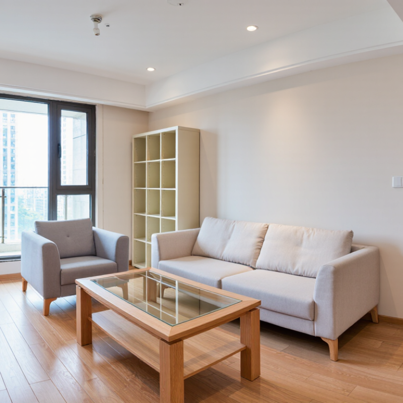
Light colors often make a room feel larger because they reflect more available light. Soft white, pale beige, misty blue, and light gray can visually push walls outward. In my experience, a small dining room with warm white walls felt less crowded after replacing dark curtains. The floor still looked narrow, though. Color cannot fix every proportion.
The eye also notices contrast. Matching the wall, ceiling, and large furniture in related shades creates a smoother visual flow. A pale ceiling can make the room feel taller, while darker side walls may make it feel narrower. Glossy surfaces reflect light, but too much shine can feel cold and distracting. Natural daylight changes everything. A color that looks spacious at noon may appear dull at night.
Tips: Test paint on several walls before choosing. Observe it in morning and evening light. Keep large furniture within one or two tones of the walls. Use one darker accent, such as a small chair or framed artwork, to add depth without breaking the room’s visual continuity. Leave some floor visible around furniture legs. This detail matters. Avoid using pure white everywhere if the room receives little sunlight; it may look gray and smaller. I once underestimated this effect. A warmer shade would have worked better.
China Top Furniture: What Color Makes a Room Look Larger?
Light colors can make a small room feel more spacious. Soft white, pale beige, misty blue, and light sage reflect more daylight. They also reduce strong visual boundaries between walls, ceilings, and furniture. The effect is subtle, not magic. Still, it works best when surfaces share similar undertones.
The Commission Internationale de l’Éclairage explains in CIE 015:2018 that higher lightness values represent brighter perceived colors. Interior designers apply this principle through high-reflectance wall finishes and pale upholstery. A 2023 National Association of Realtors Remodeling Impact Report gave interior painting a 10 out of 10 joy score. That finding does not prove that light colors enlarge rooms, but it supports painting as a practical upgrade. In my experience, eggshell finishes often balance brightness and glare better than highly glossy paint.
Choose furniture with slim profiles and similar tones. A pale oak table beside a warm-white wall creates fewer visual breaks. Keep curtains close to the wall color. Use one darker object, such as a charcoal lamp, for depth. Too much white can feel flat or cold. This is where many designs fail. Test two sample boards beside a window during morning and evening light. South-facing rooms may need cooler pale colors, while shaded rooms usually benefit from warmer cream tones.
Light Reflectance Value (LRV) indicates how much visible light a color reflects on a scale from 0 to 100. Higher-LRV colors generally reflect more light and can help a room feel brighter and more open. Actual results vary with lighting, paint finish, furniture, and window size.
When a room feels cramped, furniture color can change its visual weight before remodeling begins. In my room-styling work, pale wood, warm white, soft beige, and light gray usually make cabinets and sofas recede. These shades reflect more available light, especially near a window. A white table beside a cream wall can appear almost built in. Choose matte or lightly satin finishes. Very glossy surfaces may create glare, not spaciousness.
The best furniture colors for a larger-looking room are not always pure white. Cool daylight can make white furniture feel cold, while north-facing rooms often need sand, oat, or muted beige. In darker rooms, pale oak adds warmth without forming a heavy block. Choose one main furniture color, then repeat it on two or three pieces. This visual rhythm reduces clutter. It is a small detail.
Dark furniture can still work when used carefully. A charcoal chair or walnut side table gives depth, but several dark pieces may divide the room into hard visual islands. Leave visible floor around each item, and avoid pairing a large dark sofa with a dark rug. I once specified light gray seating for a narrow room, yet the result felt flat and overly pale. Adding natural wood legs improved it, though the first choice was not perfect. Test color samples in the morning and evening; artificial light can turn beige yellow.
A room looks larger when its major surfaces share a calm, light visual value. Soft white, pale greige, misty blue, and warm beige reflect natural light effectively. Walls should not be pure white automatically. Strong sunlight can make white walls feel harsh and cold. A slightly warm undertone often creates a more comfortable result.
Furniture should sit close to the wall color, rather than create sharp visual blocks. A light oak table, cream sofa, or pale fabric chair can keep the floor visually open. Choose furniture with raised legs when possible. More visible flooring makes a compact room feel less crowded. Keep larger pieces near the brightest walls, but avoid blocking windows. Light needs room to travel.
I have found that color samples look different throughout the day. Test them beside the window, then check them again at night. Matte finishes usually soften glare, while gentle satin surfaces can bounce more daylight. Too many pale colors, however, may make a room feel flat. Add one deeper tone through cushions, artwork, or a small cabinet. This advice is not flawless. North-facing rooms may need warmer colors, while sunny rooms can handle cooler shades. Curtains also matter; heavy, dark fabric can reduce the spacious effect. Measure the furniture carefully, because even perfect colors cannot correct poor proportions.
When people ask what color makes a room look larger, soft white, pale gray, and light beige are common answers. However, some color choices can make a room feel smaller. Charcoal, deep navy, forest green, and burgundy absorb more light. They can create a heavy feeling, especially in rooms with small windows. Warm yellow or strong orange may also feel crowded when used on every wall. Furniture with dark upholstery can reinforce that effect. I learned this after placing a dark sofa against a deep blue wall. The room looked stylish, but noticeably tighter.
Tips:
Test paint on two walls before choosing a color. Watch it in morning and evening light. Use one dark wall instead of four. Keep the ceiling lighter than the walls. Pale curtains can also increase visual height. Leave space between large furniture pieces. A crowded floor makes any color feel smaller.
High contrast can reduce visual flow. For example, dark walls, bright white trim, and black furniture create sharp boundaries. Those boundaries break the room into smaller sections. A similar wall and furniture tone often creates a calmer, wider impression. Still, light colors are not a guaranteed solution. I once used pale beige in a poorly lit room, and it looked dull rather than spacious. Reflective surfaces, layered lighting, and careful furniture scale matter too. Color should support the room’s actual light, not fight it.
Soft white, pale beige, misty blue, and light sage can reflect more available light. The effect remains subtle.
Yes. Related shades create smoother visual flow and reduce strong visual breaks. A pale table beside a cream wall may appear built in.
No. In rooms with little sunlight, pure white can look gray and smaller. A warmer cream may work better.
Pale wood, warm white, soft beige, and light gray usually make furniture recede. Pale oak can add warmth without forming a heavy block.
Yes, when used sparingly. One charcoal chair or walnut table can add depth. Several dark pieces may create visual islands.
Matte or lightly satin finishes usually work better. Very glossy surfaces can create glare and feel cold.
Test colors in morning and evening light. Daylight changes their appearance, while artificial light can turn beige noticeably yellow.
Keep curtains close to the wall color. Leave visible floor around furniture legs. Repeat one furniture color across two or three pieces.
No. Color cannot fix a narrow floor or poor furniture placement. I once chose light gray seating, but the room still felt flat.
Color plays an important role in shaping how large or small a room feels. Light, soft shades such as white, cream, beige, pale gray, and gentle pastels reflect more light and create an airy, open atmosphere. When choosing furniture, many homeowners ask, “what color furniture makes a room look larger?” The best options are usually light or neutral tones that blend naturally with the walls, helping the space appear more continuous and less crowded.
To enhance this effect, coordinate furniture colors with the room’s wall color and available natural light. Furniture in soft beige, light wood, ivory, or pale gray can make a compact room feel brighter and more spacious, especially when paired with simple designs and reflective surfaces. Dark furniture, strong color contrasts, and overly bright patterns may visually divide the room and make it feel smaller. However, carefully chosen darker accents can still add depth when used in moderation and balanced with light surroundings.
Oakes Furniture