How to Mix Wood Furniture Colors in 2026

Time:2026-09-21 Author:Amelia
0%

In 2026, mixed wood furniture is moving beyond rigid matching rules. A walnut table can sit beside an oak console when their undertones, textures, and proportions feel connected. This guide explains how to mix wood furniture colors with practical, room-tested methods rather than relying on guesswork. Warm woods, such as walnut, teak, and honey oak, usually create a welcoming atmosphere. Ash, pale oak, and maple can make smaller rooms feel brighter.

Start with one dominant wood, then introduce one or two supporting finishes. For example, a medium oak dining table may pair with a darker walnut cabinet and a light ash bench. Repeat each tone at least twice. A walnut frame on a mirror or a small tray can make the darker cabinet feel intentional. Texture matters, too. A wire-brushed surface reflects light differently from polished veneer, even when both pieces share similar colors.

Trust the room’s natural light. A wood sample that looks balanced in a showroom may appear orange beside a south-facing window. Test samples near flooring, curtains, and wall paint during morning and evening hours. Keep the contrast visible, but not chaotic. That balance is imperfect. Some combinations will look better in photographs than in daily life. Adjusting one chair, lamp, or rug may solve the problem without replacing expensive furniture. Material guidance from reputable manufacturers and experienced interior designers can support decisions, but your room’s scale and lived experience remain essential. Small experiments often reveal more than a perfect color chart.
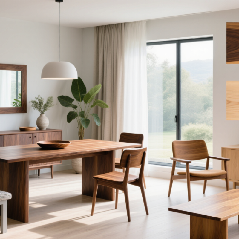
How to Mix Wood Furniture Colors in 2026

Classify Wood Undertones with CIE L*a*b* Color Coordinates

When mixing wood furniture in 2026, I start with undertones, not matching stains. CIE Lab color coordinates turn visual guesses into measurable information. L describes lightness, from black to white. The a value tracks green to red. The b value tracks blue to yellow. That separation matters. Two brown surfaces may clash because one leans red while another leans yellow.

I measure each finish under neutral daylight, using a calibrated color meter when available. I record readings from the tabletop, edge, and shaded areas. Then I compare the averages. A high b value signals warmth, while a high a value suggests red or pink influence. L values help control contrast. A pale oak table can balance a darker walnut chair when their undertones do not compete. Keep the lightness difference moderate. Delta E estimates visible color variation, but it is not a furniture rule.

In lived-in rooms, I inspect colors at breakfast, evening, and under warm bulbs. Wood changes character. I leave sample boards beside upholstery for 48 hours before deciding. This exposes metamerism, where colors match in one light but separate in another. My method is not perfect. Meters read surfaces, not grain movement, sheen, or aged finish. A scratched armrest may need visual balance rather than numerical similarity. Use coordinates as evidence, then test the pieces together at full scale.

Choose a Dominant Wood Tone Using the 60–30–10 Color Ratio

Mixing wood furniture becomes easier when one tone leads the room. The 60–30–10 ratio offers a practical framework, not a rigid decorating law. Use about 60 percent for the dominant wood, such as flooring, a large table, or built-ins. This anchor should appear in several visible areas. I often test samples beside daylight, warm bulbs, and nearby fabrics before choosing. Wood changes character throughout the day.

Reserve 30 percent for a supporting wood with a related undertone. A honey-toned chair can soften a deeper walnut cabinet without making the room look accidental. Keep the grain direction and finish in mind. Too many glossy surfaces may compete. The final 10 percent works best as a small contrast. Try a dark stool, pale frame, or carved accent. Repeat that accent twice, but not everywhere. Spacing matters more than perfect matching.

For reliable results, photograph the room and mark each wood surface by visual weight. A tiny side table should not count like a six-foot cabinet. This ratio is approximate, and real rooms rarely obey it neatly. I once added a reddish piece too quickly, then noticed it pulled attention from the windows. Removing one item improved the balance. That mistake still guides my choices. Check undertones, scale, and natural light before buying another piece.

How to Mix Wood Furniture Colors in 2026

Choose a Dominant Wood Tone Using the 60–30–10 Color Ratio

Use one dominant wood tone across approximately 60% of the room, a complementary wood tone for 30%, and a contrasting accent tone for the remaining 10%. This structured ratio helps create visual balance while allowing different wood finishes to work together.

Compare Wood-Color Differences with the CIEDE2000 ΔE00 Standard

How to Mix Wood Furniture Colors in 2026

Wood furniture rarely matches by eye alone. Lighting, moisture, grain direction, and finish can shift the perceived color. The USDA Forest Products Laboratory’s Wood Handbook reports that wood appearance changes with species, surface exposure, and moisture content. Measure samples under controlled conditions instead. Use a spectrophotometer with D65 illumination and a 10° observer setting. Record L*, a*, and b* values from several points.

Compare each sample using the CIEDE2000 ΔE00 formula. This method applies corrections for lightness, chroma, and hue differences. It is defined within the ISO/CIE 11664 color-measurement framework and builds on research published in Color Research and Application. A smaller ΔE00 usually means a closer match, but no universal tolerance fits every room. High-gloss finishes can make a small numerical gap look larger. That is easy to overlook.

Tips: Test finished samples, not raw boards. Measure three areas and average them. Keep the grain direction consistent. View the pieces beside a neutral gray card. A practical starting point is ΔE00 below 2 for close matching, while ΔE00 from 2 to 5 may remain acceptable for natural wood. These ranges are not laws. Human vision, room lighting, and texture still matter. I would recheck the samples after 24 hours, because the finish may darken slightly. CIEDE2000 improves decisions, but it cannot replace judgment.

Test Furniture Finishes Under 2700–3000 K Residential Lighting

How to Mix Wood Furniture Colors in 2026

Test furniture finishes under 2700–3000 K residential lighting. This warm range can turn pale oak honey-colored and make walnut appear deeper. I test samples beside a window first, then under a 2700 K lamp after sunset. The difference is often surprising. It is also easy to misjudge.

The Illuminating Engineering Society separates correlated color temperature from color rendering quality.

Therefore, a 3000 K bulb does not guarantee accurate wood tones. Check the lamp’s CRI, preferably 90 or higher, before comparing finishes. The U.S. Department of Energy reports that LED lighting can use at least 75% less energy than incandescent lighting. Efficient, yes, but inexpensive LEDs may still distort red and amber undertones. A finish that looks balanced in a showroom may become orange in a dining room.

Tips:

Place three wood samples under the actual room bulbs. View them from one meter away. Compare them at night and during daylight. Keep the wall color visible, because surrounding colors affect perception. Choose one dominant wood, then repeat a secondary tone through smaller pieces. Avoid matching every grain perfectly; controlled contrast usually feels more natural. I sometimes reject a beautiful sample after testing it for two evenings. That sounds excessive, but first impressions can be unreliable. For stronger accuracy, document the bulb’s CCT and CRI beside each sample, following color-evaluation principles outlined by the CIE’s colorimetry standards.

Limit the Palette to Three Wood Finishes for Visual Balance

How to Mix Wood Furniture Colors in 2026

Limit the Palette to Three Wood Finishes for Visual Balance

Mixing wood furniture feels easier when the room follows a clear limit. Choose three wood finishes: one dominant, one supporting, and one small accent. This approach creates variety without making the space feel unsettled. For example, warm oak can cover the floor and main table, while walnut adds depth through a cabinet. A darker finish may appear on a stool or picture frame. Keep repeated finishes visible from different angles. The room will feel connected.

Tips: Place samples together before buying. Check them in morning and evening light. Wood tones can shift noticeably. Match undertones, not just darkness.

In my experience, contrast works best when the furniture shapes remain simple. A pale finish beside a medium brown surface can look intentional, especially with woven fabrics and aged metal nearby. Avoid matching every piece too closely; perfect coordination often feels flat. However, three finishes are not a strict law. A fourth tone may work when it appears in tiny details, such as a handle or tray. I have made rooms too complicated by adding “just one more” wood element. It usually weakened the visual rhythm. Leave some surfaces unpaired. The empty space helps each finish breathe.

FAQS

How does the 60–30–10 ratio help mix wood furniture?

Use one wood tone for about 60 percent of the room. This may include flooring, built-ins, or a large dining table. Add a related tone for roughly 30 percent. Reserve the final 10 percent for small contrast pieces. It is a guide, not a law.

What should be the dominant wood tone?

Choose the wood with the greatest visual weight. A six-foot cabinet matters more than a small side table. Repeat the dominant tone in several visible areas. This creates a calmer foundation. Scale matters.

How can a supporting wood tone improve the room?

Select a supporting wood with a related undertone. A honey-toned chair can soften a deeper brown cabinet. Keep the grain direction and finish in mind. Several glossy surfaces may compete for attention. The mix may still feel slightly uneven.

Where should I use the final contrast tone?

Use contrast on a dark stool, pale frame, or carved accent. Repeat that accent twice for visual connection. Avoid scattering it across every surface. Spacing often matters more than exact matching. Less can work better.

How should natural light affect wood color decisions?

Place finished samples beside daylight and warm bulbs. Check them near fabrics and wall colors. Wood can look lighter in the morning. It may appear warmer under evening bulbs. Light shifts.

How can I compare wood colors more accurately?

Photograph the room and mark each wood surface by visual weight. For technical testing, measure finished samples with controlled lighting. A spectrophotometer can record L, a, and b values. Use D65 illumination and a 10° observer setting. Raw boards are unreliable.

What does a CIEDE2000 ΔE00 value tell me?

CIEDE2000 estimates visible differences in lightness, chroma, and hue. A smaller ΔE00 usually indicates a closer color match. Values below 2 can suit close matching. Values from 2 to 5 may remain acceptable for natural wood. These ranges are not universal.

What practical checks should I make before buying another piece?

Measure three areas of each finished sample. Average the readings and keep grain direction consistent. View samples beside a neutral gray card. Recheck them after 24 hours, because finishes may darken. I once added a reddish piece too quickly. Removing it restored attention to the windows.

Conclusion

Learning how to mix wood furniture colors begins with understanding their undertones rather than judging only their surface shades. Use CIE L*a*b* color coordinates to identify whether each wood finish leans warm, cool, red, yellow, or neutral. Then establish one dominant wood tone and support it with secondary and accent tones using the 60–30–10 color ratio. To refine the combination, compare the finishes with the CIEDE2000 ΔE00 standard, which helps estimate whether color differences will appear subtle, coordinated, or noticeably contrasting.

Lighting also affects how wood colors are perceived. Test samples under typical residential lighting between 2700 and 3000 K before making final decisions, since warm light can intensify golden, amber, and reddish undertones. For a balanced and intentional room, limit the palette to three wood finishes, repeat each tone thoughtfully, and use surrounding textiles, walls, and accessories to connect the variations. This practical approach explains how to mix wood furniture colors while maintaining harmony and visual clarity.

Amelia

Amelia

Amelia is a seasoned marketing professional with a wealth of expertise in our company’s core offerings. With an unwavering passion for driving growth and innovation, she plays a pivotal role in shaping our marketing strategies and enhancing brand visibility. A key aspect of her responsibilities......